
Software landing page
PulseApp
Landing page for an analytics product, with a dashboard preview and clear pricing tiers.
What the site needed to do
Show what the product does on the first screen, make the plans easy to compare, and give visitors a clear way to start a trial or book a walkthrough.
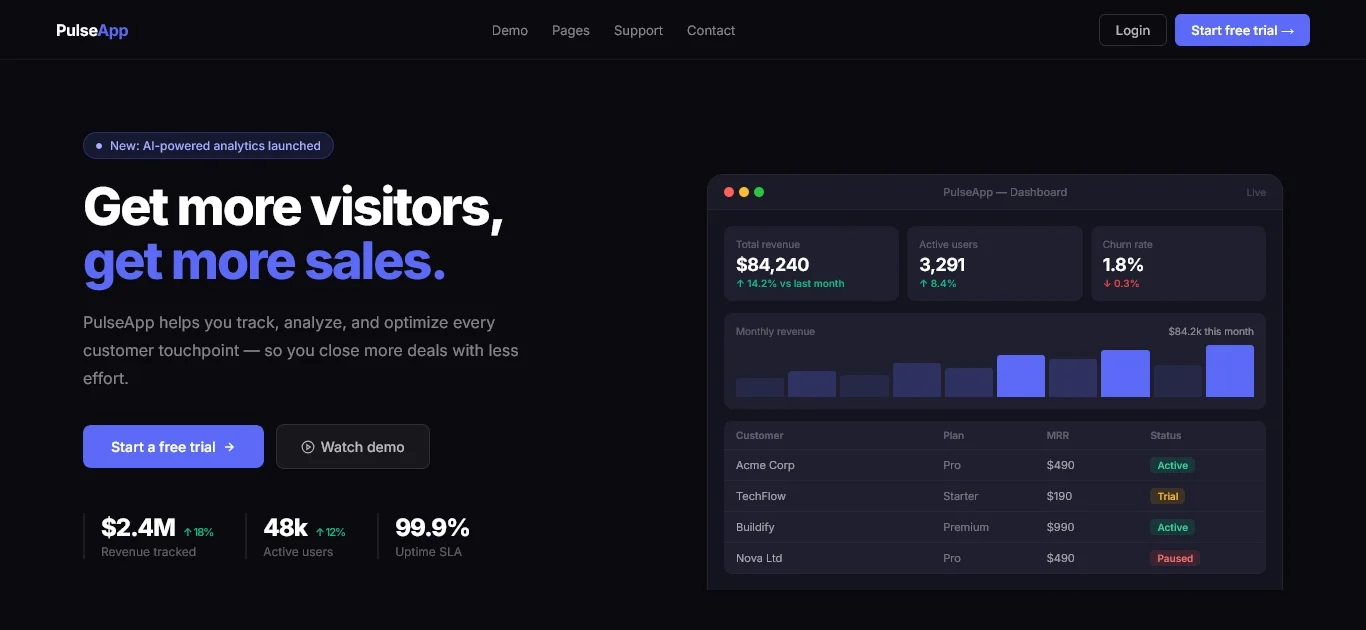
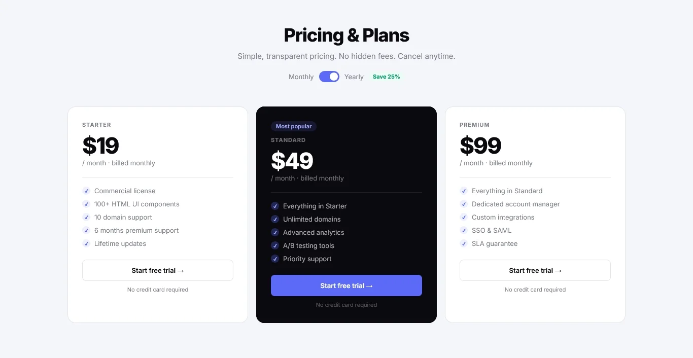
PulseApp is a landing page for a fictional analytics product. It shows a preview of the dashboard, sets out three pricing tiers side by side, and uses a dark color scheme with large, readable type.
- The product comes firstThe page opens with a preview of the dashboard, with enough space around it that the charts are easy to read.
- Plans side by sideThree pricing tiers sit in one row, each with its limits in plain words, so a visitor can compare plans without going back and forth.
- Proof after the productReviews and figures come after the preview, so they back up what the visitor has already seen. The reviews are sample content. A real site would use the client's own.
More from the site
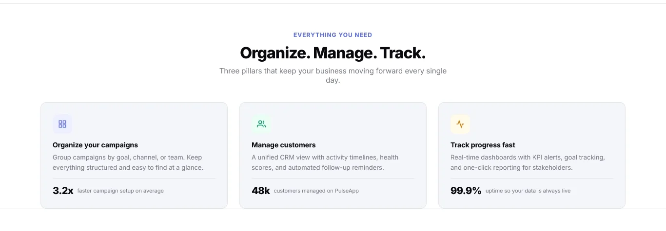
Two more sections from the same page.
Next step
Get a quoteWant a page planned like this for your business?
Tell us what you do and we’ll send you a price.